
Histograms and Bar Charts
Histograms and bar charts are the most commonly used tools for visualizing data. While they might appear to be similar, they have very distinct roles and are used in different scenarios. Understanding the disparities between histograms and bar charts is important for correctly conveying information and deriving relevant insights from data. In this guide, we’ll delve deep into several aspects of histograms and bar charts, focusing on their characteristics, applications, and appropriate usage.
Part 1 – Histograms vs. Bar Charts: Unveiling the Distinctions
Histograms:
A histogram is a graph that shows how numerical data is distributed. Unlike bar charts, which show data in categories, histograms are made especially to show data sequentially. They are made up of continuous rectangles, each of which stands for a distinct range of values, whose height reflects the frequency of observations.

Key Features of Histograms:
Continuous Data Representation: For displaying data that falls on a continuous numerical scale, like age, height, or temperature, histograms are perfect.
Frequency Distribution: In a histogram, the height of each rectangle denotes the number or frequency of data inside that bin.
Bins: The data range is divided into intervals by bins, and each interval is shown in the histogram as a rectangle. Depending on the intended level of granularity and the distribution of the data, the bins’ widths may change.
No Gaps Between Bars: Because the data in a histogram is continuous, there are never any gaps between the bars. To show that the data is continuous, the bars are in contact with one another.
Applications of Histograms:
Analysing Distribution Patterns:
The purpose of Histograms serves in statistical analysis for visualizing the distribution of data and identifying patterns such as normal distribution, skewed distribution, or bimodal distribution.
Determining Central Tendency and Dispersion:
Histograms evaluate measures of central tendency (mean, median, mode) and dispersion (variance, standard deviation) within a dataset.
Detecting Outliers:
Outliers are anomalous data points which can be easily identified on a histogram, aiding in data cleaning processes and outlier detection.
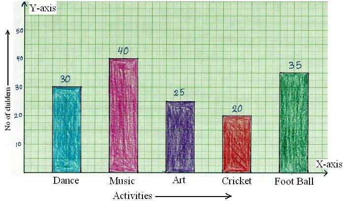
Bar Charts:
Bar charts are graphical depictions of categorical data. They are made up of rectangular bars, each of whose height or length indicating the frequency or volume of the data it represents. In contrast to histograms, which show continuous data, bar charts are meant to show distinct groupings or categories.

Key Features of Bar Charts:
Categorical Data Representation:
For visualizing categorical data, such as product categories, demographic groups, and survey results, bar charts are perfect.
Discrete Categories:
Each bar represents a separate group, and the length of the bar is the value or frequency associated of that category.
Equal Width Bars:
The bars in a bar chart usually have the same width and are divided by regular gaps to distinguish between different categories, unlike histograms where the width of the bins might vary.
Non-Overlapping Bars:
In a bar chart, the bars are typically spaced apart and do not touch each other, as they represent distinct categories.
Applications of Bar Charts:
Comparing Categories:
Bar charts are useful for comparing the frequency, magnitude, or proportion of different categories within a dataset.
Tracking Changes Over Time:
Bar charts can be used to study changes in categorical data with time, such as sales performance and review by month or demographic changes in each period.
Presenting Survey Results:
Bar charts are ideal for survey responses or categorical data collected from research studies mainly for easy interpretation and analysing results.
Expanding further on the topic of histograms and bar charts, let’s delve even deeper understanding how they are constructed, how to perceive them best, and other situations in which each visualization technique comes in handy.
Construction of Histograms:
The range of continuous data is first divided into intervals or bins to generate histograms. In order to appropriately maintain the level of granularity while accurately representing the underlying distribution of the data, these bins should be carefully selected. Choosing too few bins can cause simplicity and the loss of crucial information, while choosing too many bins can cause noise and make interpretation more challenging.
The frequency or count of observations falling within each bin is estimated after the bins have been established. The height of the matching rectangle in the histogram then represents this frequency. To maintain the integrity of the representation, it is imperative that the area of every rectangle precisely represents the frequency within the bin.

Best Practices for Interpreting Histograms:
While analysing histograms, one studies the shape, center, and spread of the distribution, as well as identifies any outliers or unusual patterns. Key considerations include:
Distribution Shape:
Histograms can take on different forms, such as multimodal (having multiple peaks), skewed (having a positive or negative skew), or symmetric (normal distribution). Knowing the distribution’s shape helps guide further analysis and offers insights into the underlying features of the data.
Central Tendency and Spread:
The typical or core value of the data is shown by central tendency measures like the mean, median, and mode. Furthermore, quantifying the variability within the dataset is aided by evaluating the spread or dispersion of the data using metrics like variance or standard deviation.
Outlier Detection:
Data points known as outliers, or those that differ noticeably from the rest of the data, can skew statistical analysis and have an impact on how results are interpreted. By graphically emphasizing observations that deviate from the predicted range or distribution pattern, histograms aid in the detection of outliers.
Construction of Bar Charts:
Rectangular bars are plotted along the y-axis to show the frequency, amplitude, or proportion of each discrete category or group. This is how bar charts are created. Each bar’s height or length is correlated with the value assigned to that category, making it simple to compare several categories.
To aid with comprehension, it is crucial to make sure that the categories in bar charts are labelled and arranged correctly. In addition, careful consideration should go into selecting the y-axis’s scale to maximize readability and appropriately depict the data.
Best Practices for Interpreting Bar Charts:
While studying bar charts one should analyse the heights or lengths of the bars to assess the relative frequency or magnitude of each category. Key considerations include:
Comparing Categories:
Bar charts are a useful tool for comparing data across various groups or categories in a dataset. By visually examining the heights or lengths of the bars, analysts can rapidly spot trends, patterns, or inequalities.
Identifying Patterns Over Time:
By comparing variations in bar heights over time, analysts can spot trends, seasonality, or anomalies in situations where bar charts are used to depict categorical data over time, such as sales performance by month or demographic alterations over several years.
Communicating Results Effectively:
To guarantee understanding, it’s critical to include clear labels, titles, and annotations when presenting bar charts to stakeholders or decision-makers. Using color, patterns, or annotations can also improve the visual appeal and provide more details or insights.
Additional Scenarios Where Each Visualization Method Is Invaluable:
Although bar charts and histograms are frequently used in statistical analysis and data presentation, there are other situations in which each technique is quite useful:
Histograms in Quality Control:
In quality control procedures, histograms are widely used to evaluate the distribution of product attributes, including dimensions or performance measures. Manufacturers can spot deviations from requirements and take corrective action to preserve product quality by examining the distribution of measured values.
Bar Charts in Market Research:
When it comes to illustrating survey results, client preferences, or market segmentation data, bar charts play a crucial role in market research studies. Market researchers can determine consumer trends, preferences, and market prospects by clearly and concisely presenting category data.
Combined Use for Comprehensive Analysis:
Combining bar charts and histograms might occasionally result in a more thorough knowledge of the data. Histograms, for instance, can be used by analysts to investigate the distribution of continuous variables inside the many categories shown in a bar chart, providing more in-depth understanding of the connections between the variables.
FAQs
What’s the difference between histograms and bar charts?
While both show data distribution, histograms represent continuous data, while bar charts are used for discrete data.
How do I create a histogram?
To create a histogram, organize your data into intervals or bins and then plot the frequency of data points within each interval.
When should I use a bar chart instead of a histogram?
Use a bar chart when you want to compare distinct categories or show discrete data, whereas histograms are suitable for visualizing continuous data distributions.
How do I interpret a histogram?
To interpret a histogram, look at the height of each bar, which represents the frequency of data within that range.
Conclusion
Histograms are most suited for showing the distribution of continuous numerical data, but bar charts are more effective in illustrating categorical data and making comparisons between various groups or categories. Data analysts, researchers, and decision-makers can effectively use these visualization approaches to obtain insights, make educated decisions, and clearly convey findings if they grasp the differences between bar charts and histograms.

Milan Desai
Chief Technology Officer
Milan Desai has more than 20 years of industry experience in working with clients to solve business problems. Passionate about leveraging technology for improving the quality of life and optimize the use of resources. Currently, working on utilizing data to drive business decision making process and user understanding of key metrics that drive the organization and markets in general. Co-founder of EzDataMunch – the first BI Apps store in the world.