
User Interface and Dashboard Design are crucial aspects to keep in mind while designing a website or an app. While User Interface focusses on enhancing the overall experience of the user while on the site, Dashboard Design’s purpose is to give an overall aesthetic outlook. Be it a website, application, or software platform, both focus on the following key aspects – influencing user behaviour, boosting engagement and retention rates, and creating an ultimate actionable presentation of data. User Interface and Dashboard Design play a crucial role in reducing Information saturation by optimising overall experience for the user. In this comprehensive guide, we delve into the principles, best practices, and emerging trends in UI and dashboard design in order broaden our understanding.
Understanding User Interface Better
A well-designed user interface can boost the brand’s credibility in addition to its aesthetic appeal. The careful use of UI elements, such as colour schemes, typography, and visual components, can reflect a brand’s personality and provide a consistent experience across all platforms.
The interactive and visual components of a digital product that users interact with are included in user interface design. It entails designing a fluid and user-friendly interface that makes it possible for customers to use, engage with, and benefit from the product. The following are some key aspects to remember while designing UI:
Consistency:
Consistency in design elements such as colours, fonts, buttons, and icons throughout the interface must remain the same since consistency fosters overall familiarity with the website/app and helps create distinction of the various functions.
Simplicity:
Cluttering the interface with unnecessary elements can overwhelm users. Whereas focusing on clarity, ease of use, simplicity can attract more users.
Hierarchy:
Establishing a clear hierarchy of information to guide users’ attention through the page is necessary. This can be smoothly administered by using visual cues such as size, colour, and placement to highlight important elements and actions.
Feedback:
Providing instant feedback for any action with UI elements to users can be a brilliant tactic for user interface. Feedback can include various animations, tooltips, or changes in element to indicate the successful completion of an action.
Accessibility:
Ensuring that the UI design is Disabled-friendly. Hence, it is necessary to include considerations such as colour contrast, keyboard navigation, and screen reader compatibility.
Dashboard Design Best Practices
Dashboards give users insights into important metrics, trends, and performance indicators through visual representations of data and information. Achieving a balance between utility and aesthetics is essential for effective dashboard design. The following are some guidelines for creating dashboard designs:
Define Purpose and Audience:
It is necessary to define the purpose and target audience of the dashboard before designing it. Having knowledge of the specific metrics and insights that users need to derive from the dashboard, will help in your design decisions.
Keep it Relevant:
Only certain information that are relevant and actionable need to be displayed for your dashboard design. Cluttering the interface with excessive and irrelevant data and metrics will distract users from key insights.
Use Visualizations Wisely:
Select visualizations such as charts, graphs, and gauges to represent different types of data that effortlessly convey the underlying trends and patterns without confusing users with irrelevant detail.
Provide Interactivity:
Include interactive features that allow visitors to go further into the data, such as drilldowns, tooltips, and filters. Interactivity makes consumers more engaged and gives them the ability to get more in-depth insights out of the dashboard.
Design for Mobile Responsiveness:
Make sure the dashboard is mobile device friendly and optimized. As more people visit dashboards on smartphones and tablets, mobile responsiveness is crucial.
Emerging Trends in UI and Dashboard Design
The field of User Interface and dashboard design is constantly evolving, driven by technological advancements, and changing user expectations. Here are some emerging trends shaping the future of UI and dashboard design:
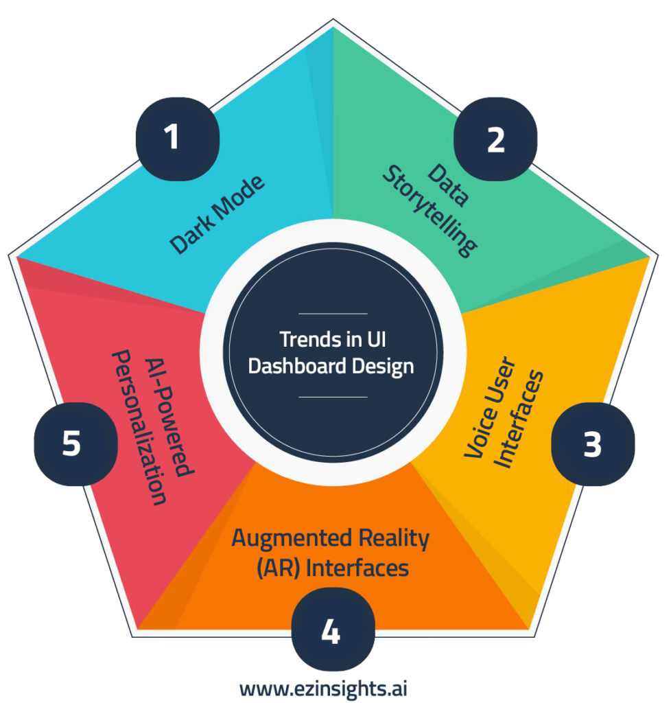
Dark Mode:
Dark mode interfaces, known for dark colour schemes are popular due to their visual appeal and reduced eye strain, especially in dim environments. This way UI designers provide better flexibility and user experience.
Data Storytelling:
Using narrative techniques, data storytelling communicates trends and insights found in the data. Designers may improve user engagement, knowledge, and decision-making by creating an engaging narrative around the data displayed on dashboards.
Voice User Interfaces (VUI):
VUI is becoming more and more important in UI design as voice-activated smart gadgets and virtual assistants proliferate. Hands-free operation is made possible and accessibility for people with mobility disabilities is improved by incorporating voice commands and interactions into user interface designs.
Augmented Reality (AR) Interfaces:
AR interfaces produce immersive user experiences by superimposing digital data and visualizations over the real world. AR interfaces provide creative methods to display data and involve consumers in interactive experiences in sectors including retail, education, and healthcare.
AI-Powered Personalization:
Customized user interfaces are provided by AI-powered personalisation/ customization algorithms that examine user behaviour and preferences. AI-driven interfaces improve user pleasure and engagement by dynamically modifying information, layout, and recommendations based on unique user profiles.
Overcoming Challenges in UI and Dashboard Design
Although having a solid understanding of UI and dashboard design is essential for developing effective digital goods, designers frequently run into a few obstacles. Providing outstanding user experiences requires an understanding of these obstacles and the application of solutions. The following are some typical problems with UI and dashboard design, along with solutions:
Information Overload:
Presenting a lot of information in a clear and understandable way is one of the main difficulties for dashboard design. Prioritize and arrange the most pertinent material in a hierarchical manner to help you cope with information overload. Make advantage of grouping, filtering, and visual hierarchy features to assist users in concentrating on the most crucial insights without being overtaken by too much information.
User Engagement:
Maintaining user engagement with the dashboard information and interface is essential to guaranteeing the efficacy of the design. To make the interface more interesting to use, include interactive features like animations, hover effects, and gamification strategies. To keep users interested over time, update the dashboard material frequently with new perspectives and pertinent data.
Data Visualization Complexity:
It can be difficult to select the best data visualizations and present data in a way that is easy to comprehend, particularly when working with complicated datasets. Work together with domain experts and data analysts to comprehend the context of the data and choose relevant visualizations that clearly convey the most important information. Provide users with contextual explanations, tooltips, and legends to aid in accurately interpreting the visualizations.
The Future of User Interface and Dashboard Design
The future of User Interface and Dashboard Design is full of fascinating possibilities as technology develops more and user expectations change. Designers have never-before-seen chances to innovate and produce game-changing user experiences, from immersive augmented reality interfaces to AI-driven personalization. Designers have the capacity to influence the direction of user interface and dashboard design and create experiences that thrill and empower users everywhere by embracing emerging technologies, taking user feedback into account, and keeping up with industry trends.
FAQs
What makes a dashboard user-friendly?
Explore key principles and features that enhance usability, such as intuitive navigation, clear data visualization, and customizable layouts.
What are the common pitfalls to avoid when designing dashboards?
Identify potential challenges and mistakes, such as cluttered interfaces, complex terminology, and overwhelming data displays, and discover how to overcome them.
Which tools and technologies are best for dashboard design?
Get insights into popular tools and platforms for creating user-friendly dashboards, including tips for selecting the right software and optimizing workflows.
How can I measure the effectiveness of my dashboard design?
Find out about key performance indicators (KPIs) and evaluation methods to assess usability, user satisfaction, and overall impact, enabling continuous improvement and refinement.
Conclusion
Achieving a high level of user experience in digital products requires mastery of dashboard design and user interface. Using best practices, staying up to date on emerging trends, and sticking to core design principles, designers may produce visually appealing and intuitive dashboards and interfaces that enable users to engage with data efficiently and make educated decisions. UI and dashboard design will continue to be at the forefront of innovation in technology, shaping the way that digital experiences are created in the future. Jump in and see the benefits yourself! Get started with a free trial today.

Milan Desai
Chief Technology Officer
Milan Desai has more than 20 years of industry experience in working with clients to solve business problems. Passionate about leveraging technology for improving the quality of life and optimize the use of resources. Currently, working on utilizing data to drive business decision making process and user understanding of key metrics that drive the organization and markets in general. Co-founder of EzDataMunch – the first BI Apps store in the world.